Aesthetic Archaeology: The Qur’anic Folio as a Blueprint for 2026 Silhouettes
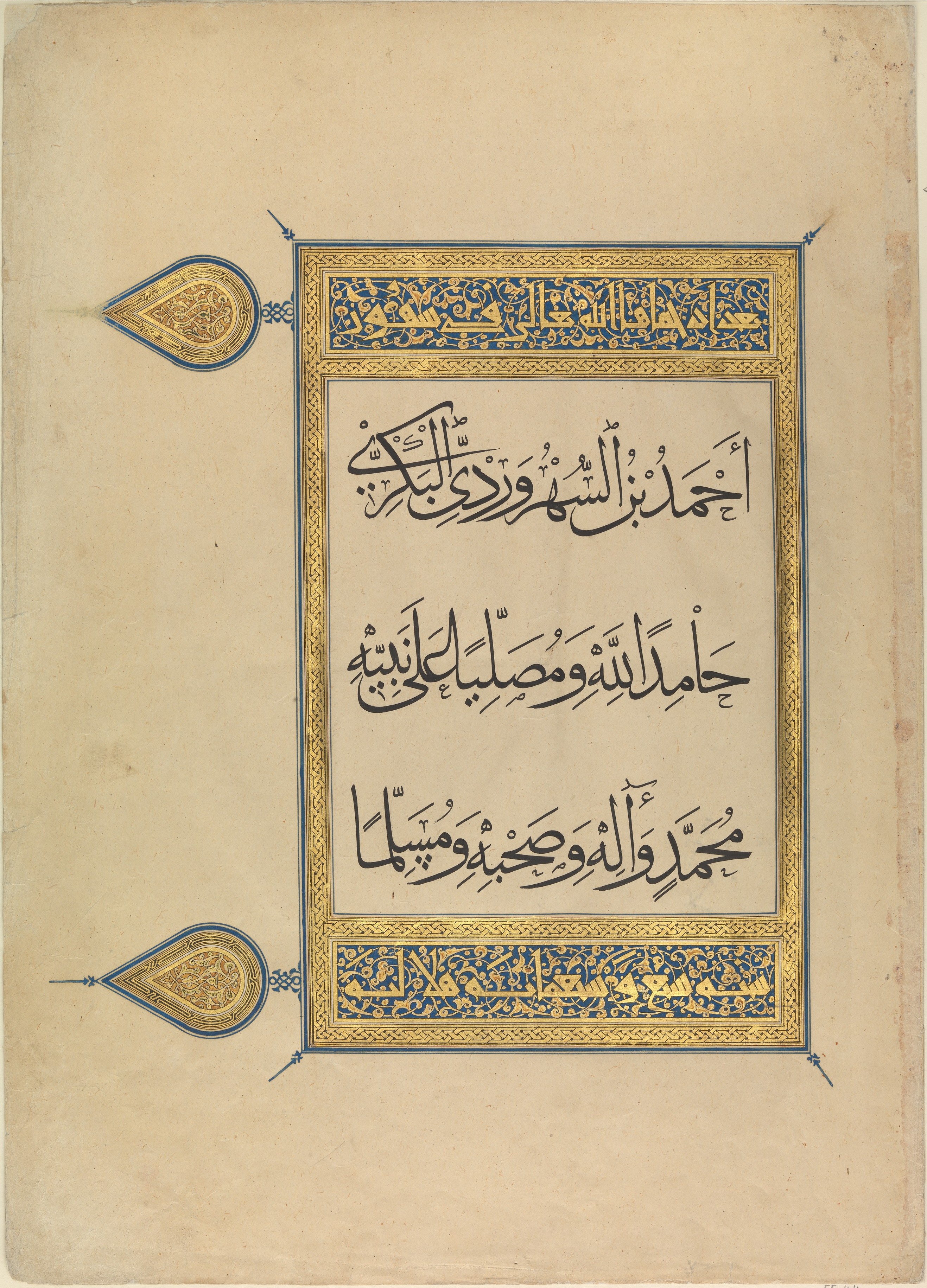
Within the hallowed confines of the Natalie Fashion Atelier archive, the isolated study of a single folio from a Qur’an manuscript—rendered in ink, opaque watercolor, and gold on paper—transcends mere historical appreciation. This artifact, a masterpiece of Global Heritage, is not a relic of a bygone era but a living, breathing lexicon of form, proportion, and luminosity. Its classical elegance, born from the rigorous discipline of sacred calligraphy and the luminous geometry of illumination, offers a profound and unexpected blueprint for the haute couture silhouettes of 2026. We deconstruct this folio not as a decorative motif, but as a structural and philosophical guide, translating its principles of balance, radiance, and rhythmic precision into the language of fabric and form.
I. The Architecture of the Line: From Kufic Script to Structural Seaming
The Geometry of the Letterform
The foundational element of the folio is its script, likely a refined Kufic or Naskh variant. The ink—a deep, almost carbon-black—defines characters with an unwavering, deliberate stroke. Each letter is a study in tension and release: a vertical alif stands as a pillar of absolute rectitude, while the sweeping curve of a nun or the sharp, angular turn of a kaf introduces dynamic asymmetry. This is not a fluid, cursive flow; it is a constructed, architectural language. For the 2026 silhouette, this translates directly into the architectural seaming of a tailored jacket or a sculpted gown. The vertical seams become the alif—elongated, unbroken lines that draw the eye upward, creating a lengthened, regal posture. The angular, geometric darts at the waist or shoulder mimic the sharp turns of the script, introducing a controlled, intellectual tension into the garment’s structure. The silhouette is not draped; it is constructed, each seam a deliberate, calligraphic stroke on the body’s canvas.
Rhythmic Intervals and Negative Space
Critically, the folio’s power lies not only in the ink strokes but in the rhythmic intervals—the negative space that surrounds and defines them. The scribe understood that silence is as potent as sound. In the 2026 collection, this principle manifests as strategic cut-outs and asymmetric paneling. A column dress might feature a single, precise slit that echoes the space between two words, creating a sense of breath and movement. A bodice could be constructed with deliberate, open gaps that reveal a secondary layer of contrasting fabric or skin, mimicking the way the eye travels across the illuminated page. The silhouette becomes a study in presence and absence, where the void is as carefully considered as the form itself.
II. The Luminous Field: Opaque Watercolor and the Palette of Preciousness
Color as Structure, Not Decoration
The opaque watercolor on the folio is applied in fields of intense, saturated hue—deep lapis lazuli, vermilion, malachite green, and ochre. These are not mere backgrounds; they are structural fields that contain and support the gold and ink. They define the boundaries of the illuminated panels, creating a visual hierarchy. For 2026, this translates into a color-blocking technique of the highest order. A silhouette might be bisected horizontally or vertically by a panel of deep, matte sapphire silk, followed by a section of burnished copper. The colors are not blended; they are juxtaposed with a hard, clean edge, creating a sense of architectural volume. The silhouette is a composition of solid, unmodulated color fields that sculpt the body, each hue acting as a structural support for the next.
The Luminosity of the Matte Finish
The watercolor possesses a characteristic matte, velvety finish. It absorbs light rather than reflecting it, creating a deep, contemplative surface. This is a radical departure from the high-shine, high-gloss of contemporary luxury. The 2026 silhouette will embrace this matte luxury. Fabrics will be chosen for their ability to absorb and diffuse light: double-faced cashmere, matte satin, sueded silks, and heavy crepes. The silhouette will not shimmer; it will glow from within. The texture becomes a primary visual element, inviting touch and contemplation. A dress’s surface is not a mirror; it is a field of deep, quiet color, a canvas for the gold to come.
III. The Gilded Cartography: Gold as a Narrative of Light and Line
Gold Not as Accent, but as Cartography
The gold in the folio is not applied as a random embellishment. It is a meticulous cartography, tracing the outlines of letters, filling the spaces between them, and forming intricate geometric rosettes and borders. It is a second, luminous script that runs parallel to the ink. In the 2026 silhouette, gold is not a trim or a beaded surface. It is a structural line of pure light. We envision metallic embroidery—not heavy, but fine, almost calligraphic—that traces the architectural seams of a garment. A seam might be outlined in a single, continuous line of gold thread, or a geometric panel might be filled with a dense, metallic pattern that echoes the illuminated rosettes. The gold acts as a luminous guide, leading the eye along the silhouette’s contours, defining its shape with an almost celestial precision.
Layered Transparency and the Gilded Veil
The most advanced application is the gilded veil. The folio’s gold leaf is often applied over the watercolor, creating a layered depth. For 2026, we propose a double-layered silhouette. An under-layer of matte, opaque color forms the base. Over this, a second layer of sheer, translucent fabric—a fine silk organza or tulle—is embroidered with a gold pattern. This outer layer acts as a luminous overlay, allowing the color beneath to subtly shift and glow. The silhouette becomes a study in depth and revelation, where the gold is not a surface decoration but a veil of light that both conceals and reveals the form beneath. The movement of the wearer animates this gilded cartography, creating a living, breathing manuscript of light and shadow.
IV. The Silhouette of the 2026 Collection
The final silhouette for the 2026 Natalie Fashion Atelier collection is a synthesis of these principles. It is a structured, architectural form defined by calligraphic seams and rhythmic negative space. It is a luminous field of deep, matte color, punctuated by the cartographic precision of gold. It is not a dress; it is a worn manuscript, a dialogue between the earthly and the divine, the ink and the light. The garments will be long, columnar, and sculpted, with sharp, angular shoulders and defined waistlines. Sleeves will be voluminous but structured, echoing the sweeping curves of the script. The palette will be drawn directly from the folio: lapis, cinnabar, malachite, and ivory, with gold as the unifying thread. This is not nostalgia. This is the future of luxury—a future built on the rigorous, silent elegance of a page written in gold and ink, a testament to the enduring power of aesthetic archaeology.